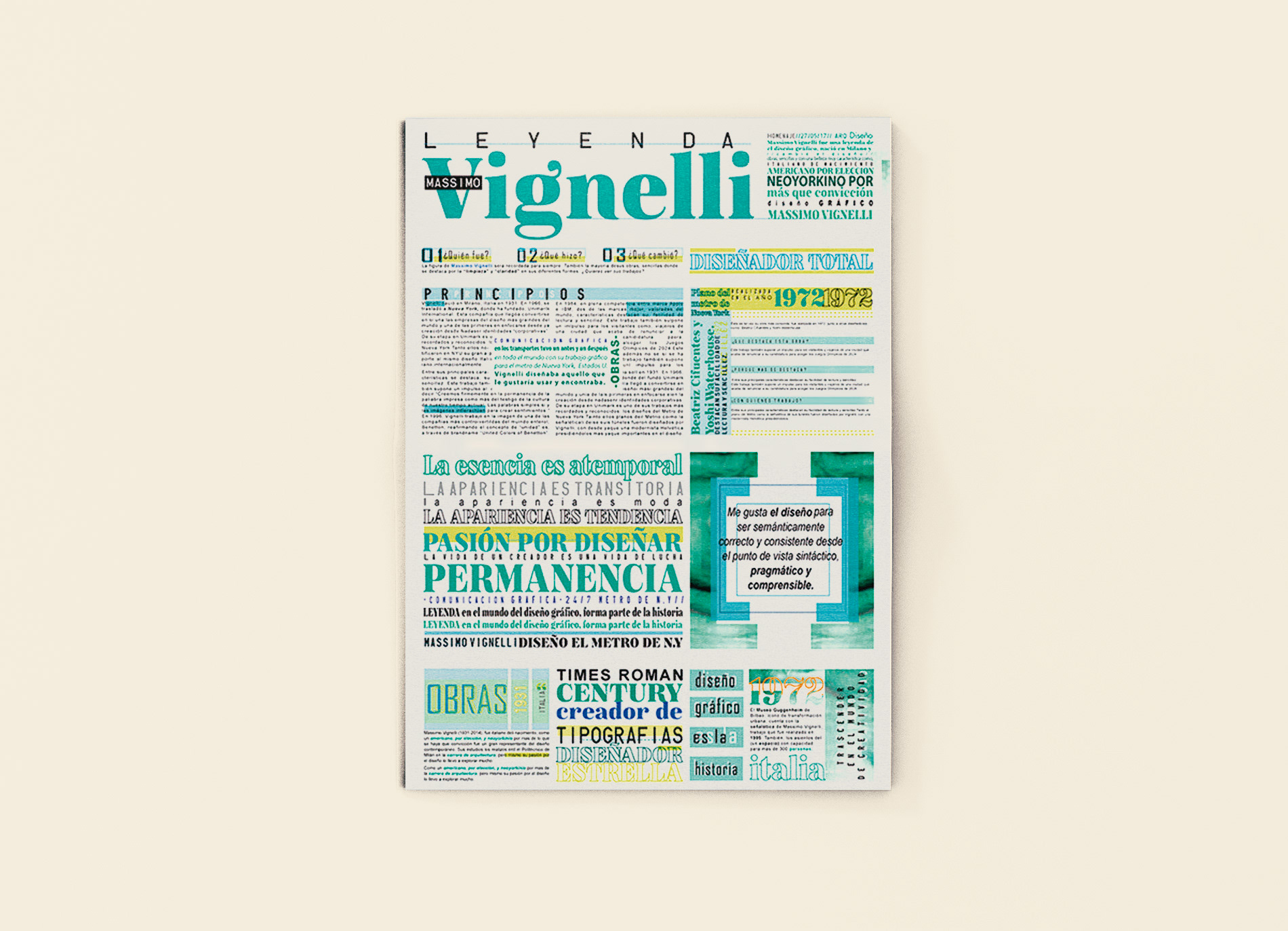
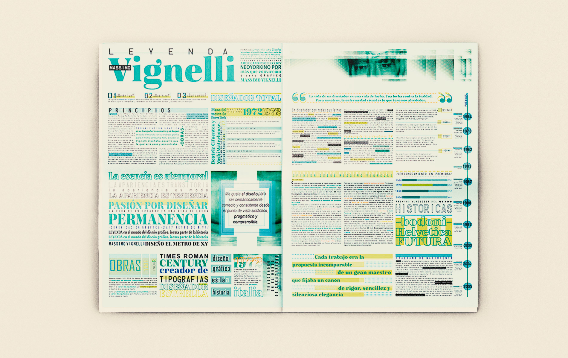
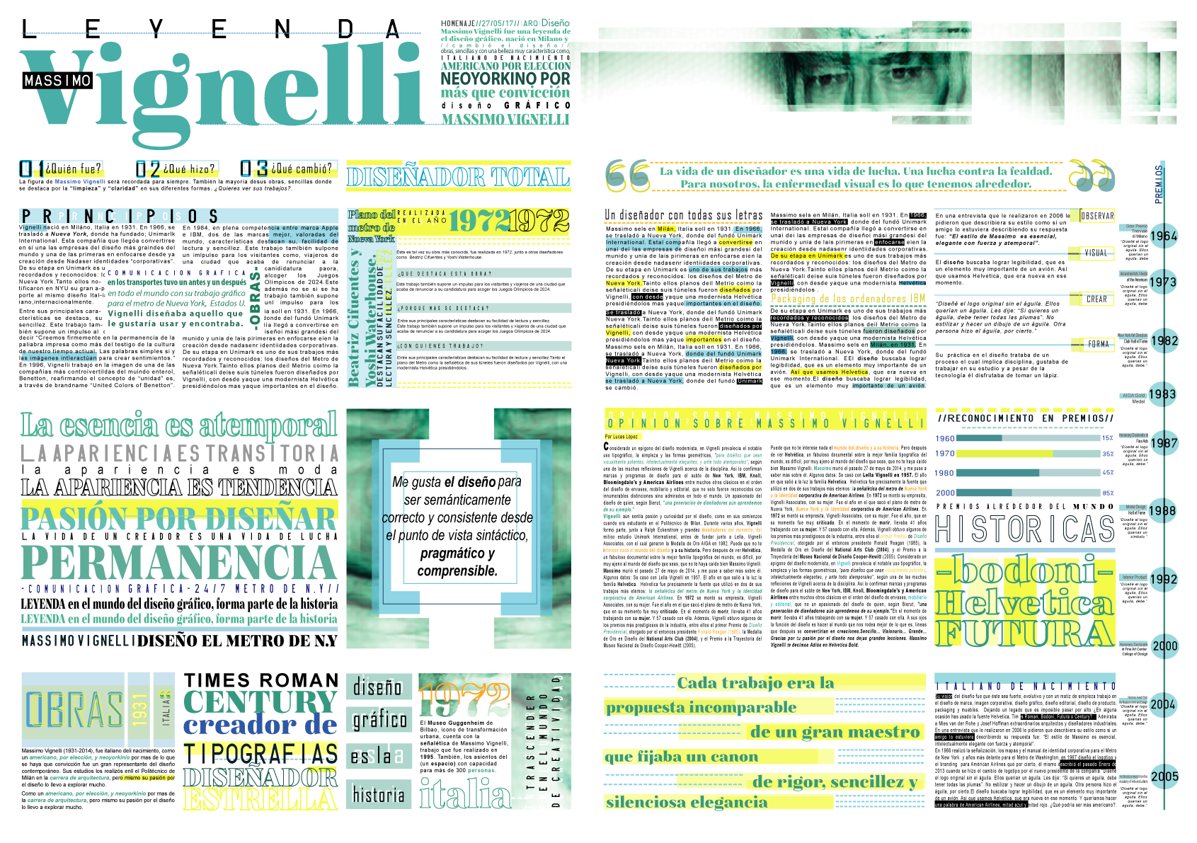
Thought-provoking newspaper edition. This project defies convention, aiming to create a structured yet visually overwhelming experience that immerses the reader in a world of information overload, inspired by Vignelli's work.
At the heart of this endeavor are two crafted pages, each brimming with an abundance of information. The primary objective was to push the boundaries of traditional editorial design, inviting the viewer to navigate a landscape that feels saturated with content, almost to the point of sensory overload.
The design concept revolves around the strategic use of typography, predominantly in shades of blues and yellows. These color choices were made with a purpose: to evoke a sense of haste, congestion, and a lack of breathing space. It's a deliberate effort to immerse the reader in a world that feels chaotic and bustling, mirroring the frantic pace of modern life.
Full version
Thank you!